


In today's fast-paced project management landscape, data is king. The ability to visualize project-related data and insights can be the key to making informed decisions, tracking progress, and ensuring the success of your projects. Jira, a leading project management tool, offers a range of powerful Jira visualization features that can help project managers and teams transform complex data into actionable information.
Definition of Visualization in Jira
Jira visualization involves presenting project-related data, statistics, and metrics in a graphical format within the Jira platform. This feature equips project managers, team leaders, and stakeholders with a comprehensive overview of a project's status, progress, and potential issues. By converting raw data into visually engaging charts, graphs, and reports, Jira visualization streamlines the comprehension of intricate project information and promotes faster and more informed decision-making.
Complex projects often pose challenges for users, making visual representations of project data a valuable tool for facilitating effective communication, analysis, and decision-making among project teams. Additionally, it assists stakeholders in making well-informed business choices.
The Role of Visualization in Project Management
Before we dive into Jira's visualization tools, let's understand why visualization is crucial in project management:
1. Data Clarity
Visualization simplifies complex data, making it easier to comprehend and act upon. This is especially vital in project management, where various variables and dependencies need to be considered.
2. Decision-Making
Visual representations of project data enable more informed and effective decision-making. Project managers can quickly identify trends, bottlenecks, and areas that require attention.
3. Stakeholder Communication
Visuals facilitate clear communication with project stakeholders. Whether it's sharing progress updates or presenting project status, visuals are more accessible and engaging.
Jira's Visualization Tools
Jira offers an array of visualization tools that cater to different aspects of project management:
1. Agile Boards
Agile boards, like Scrum and Kanban boards, provide a visual representation of your team's tasks and their progress. These boards are essential for Agile project management.
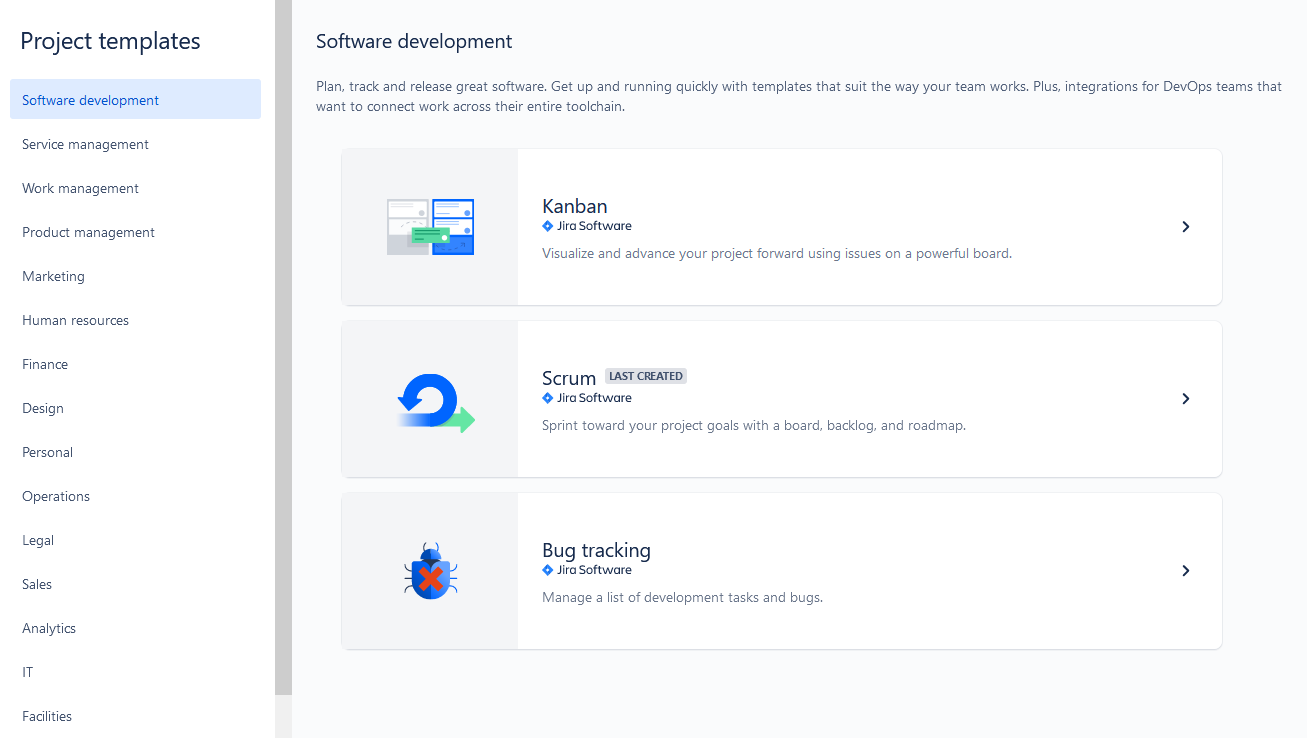
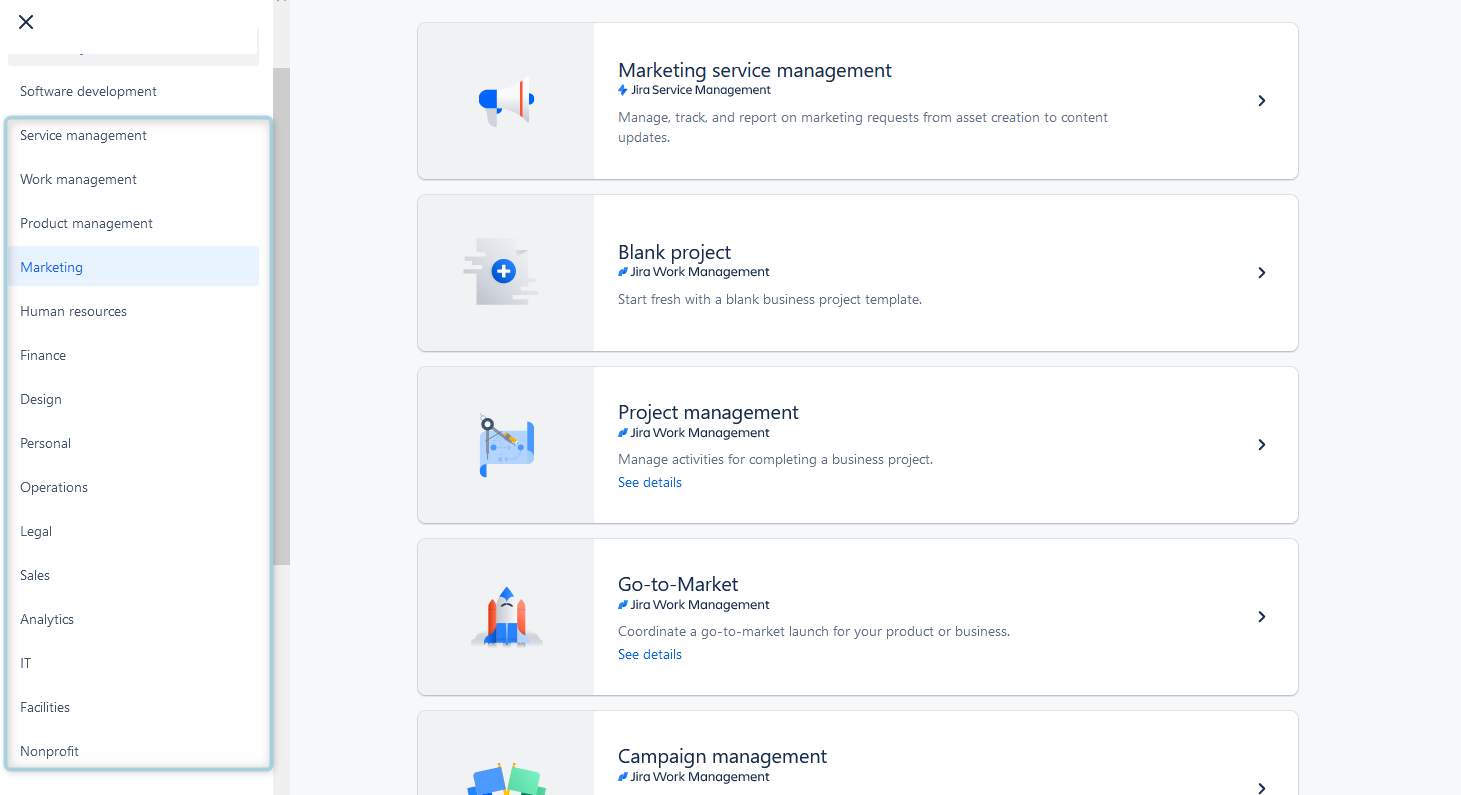
But Jira provides project templates for non-agile teams as well. They help business teams to visualize tasks and projects:
2. Gantt Charts and Pie Charts
Gantt charts provide a visual timeline of project tasks and their dependencies. They are indispensable for tracking progress and ensuring that your project stays on schedule.
Pie charts are excellent for visualizing task distribution, issue types, or project components. They offer a quick overview of the project's status.
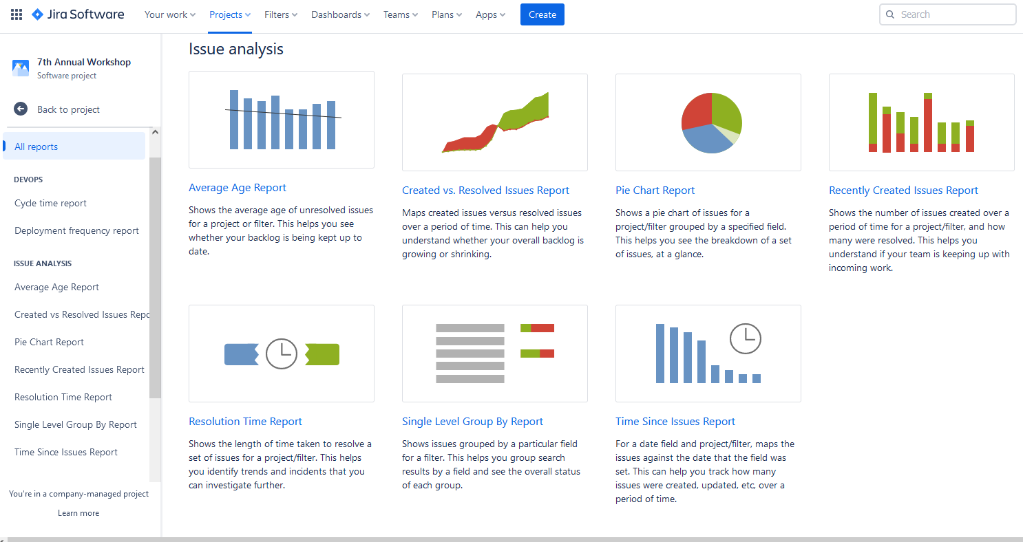
3. Jira Reports
Reports in Jira are great instruments to visualize Jira data on task execution, project and task progress, resource workload, etc.
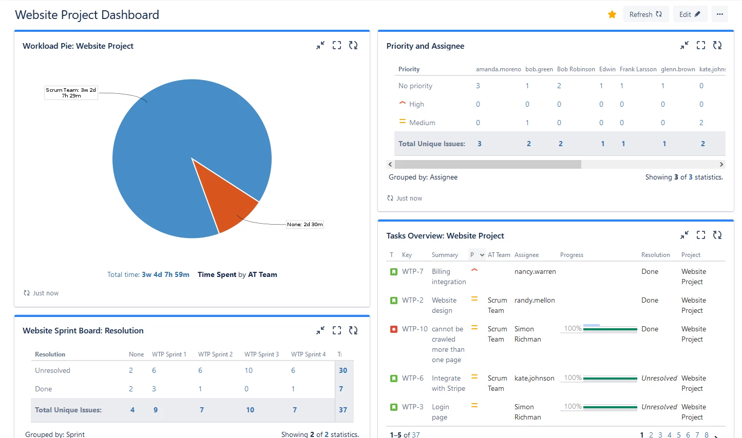
4. Jira Dashboards
Lots of experienced Jira users are keen on Jira Dashboards, as they are invaluable visualization tools for Jira. These dashboards are highly customizable and user-friendly. They serve as a central hub for teams to visualize and track their work, providing a real-time overview of project progress, key performance indicators, and important metrics.
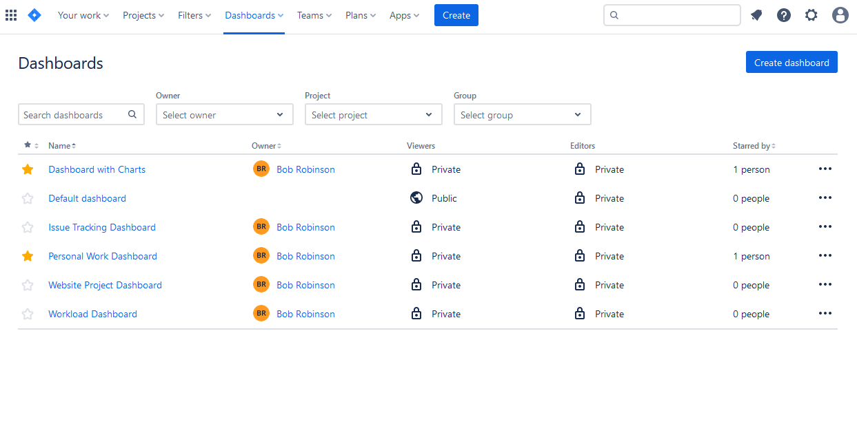
Users can create private dashboards, or share them with teams and stakeholders. You can edit the dashboard any time you need, and add various dashboard gadgets. These gadgets can display information such as burndown charts, pie charts, issue statistics, and activity streams for better visualization and tracking:
How to Utilize Jira Visualization?
To make the most of Jira's visualization capabilities, follow these steps:
1. Define Your Project Goals
Clearly outline your project's objectives and the key performance indicators (KPIs) you need to track.
2. Choose the Right Visualization
Select the appropriate visualization tool in Jira that aligns with your project's goals. For example, use a Gantt chart for timeline tracking or a pie chart for issue distribution.
3. Populate and Update Data
Enter relevant project data into Jira and ensure it's regularly updated to reflect the current project status.
4. Interpret Visuals
Regularly review and interpret the visual representations. Look for trends, discrepancies, or areas that require intervention.
5. Act on Insights
Use the insights gained from Jira's visualizations to make data-driven decisions, allocate resources effectively, and keep your project on track.
Use Add-ons for better Jira Data Visualization
Users can expand Jira data native visualization capabilities and open up a wide array of new opportunities by harnessing third-party add-ons and plugins. These enhancements empower teams to craft visually engaging and informative planning dashboards, timesheets, and reports tailored to their unique project needs.
Given the multitude of add-ons and plugins accessible in the Atlassian Marketplace, users have the freedom to select the ones that best align with their project objectives and visualization requirements.
The demand for advanced visualization of resources, project status, and issue progression remains consistently high. For example, Jira plugins, such as ActivityTimeline, offer a comprehensive solution encompassing all the aforementioned requirements through project visualization tools. It delivers a planning dashboard featuring user timelines, reports, and timesheets, and it is fully compatible with Jira Software and Jira Service Management, participating in the Atlassian Cloud Fortified Program. Is available for Jira Cloud and Jira Server.
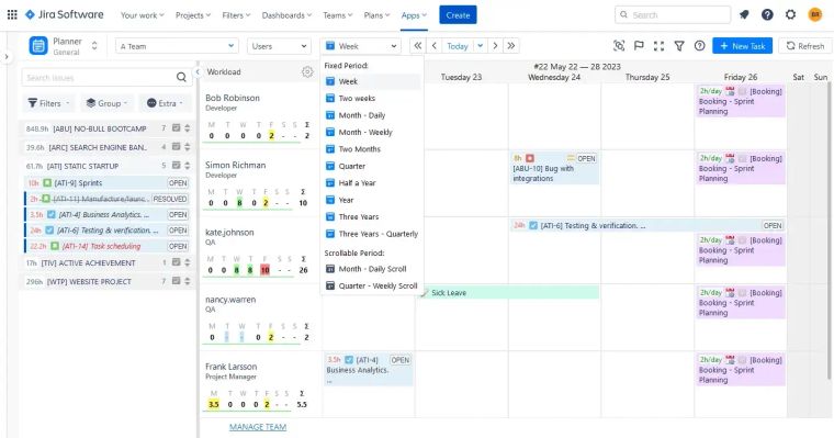
Visualize Resource and Project Progress in ActivityTimeline
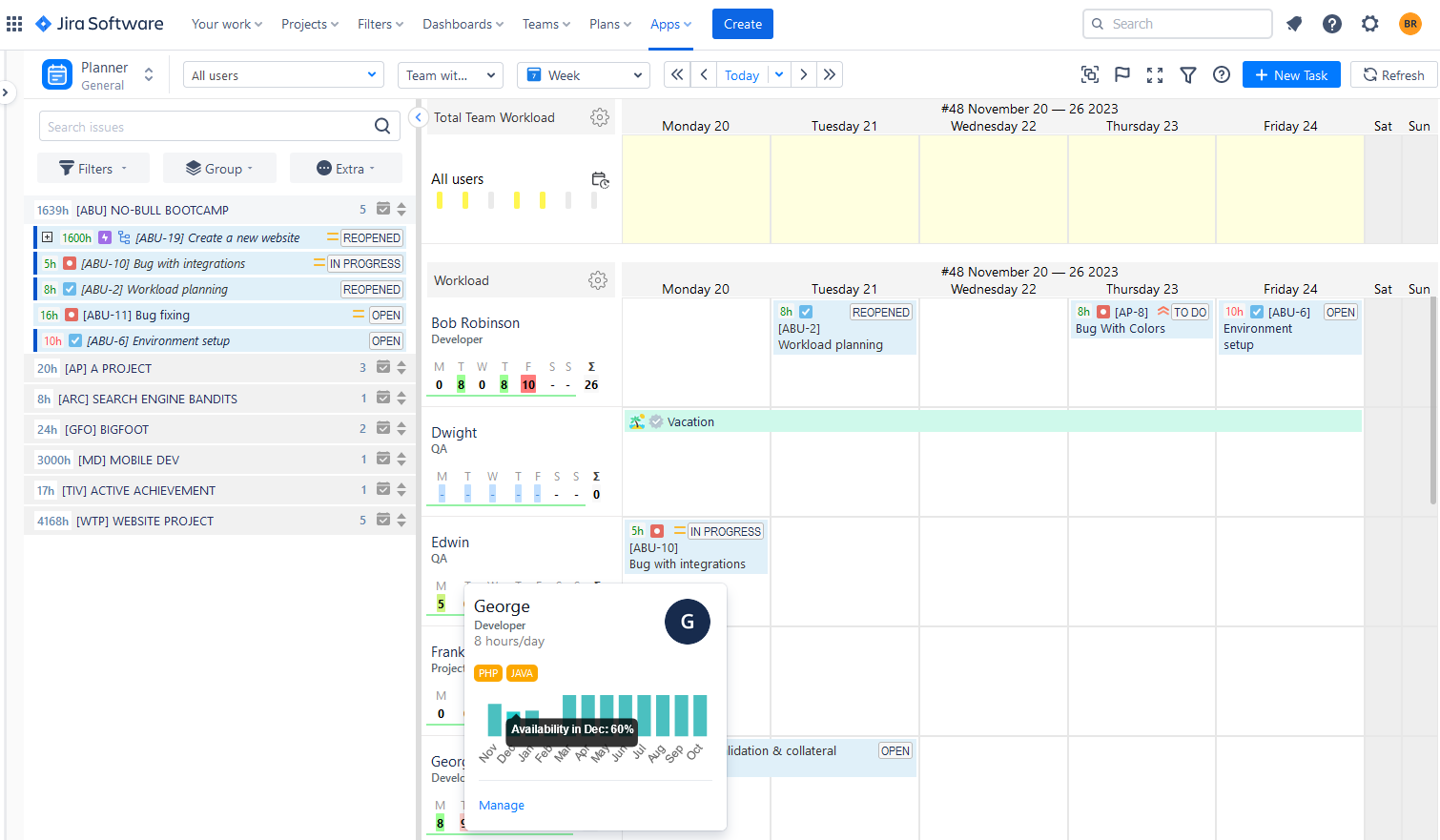
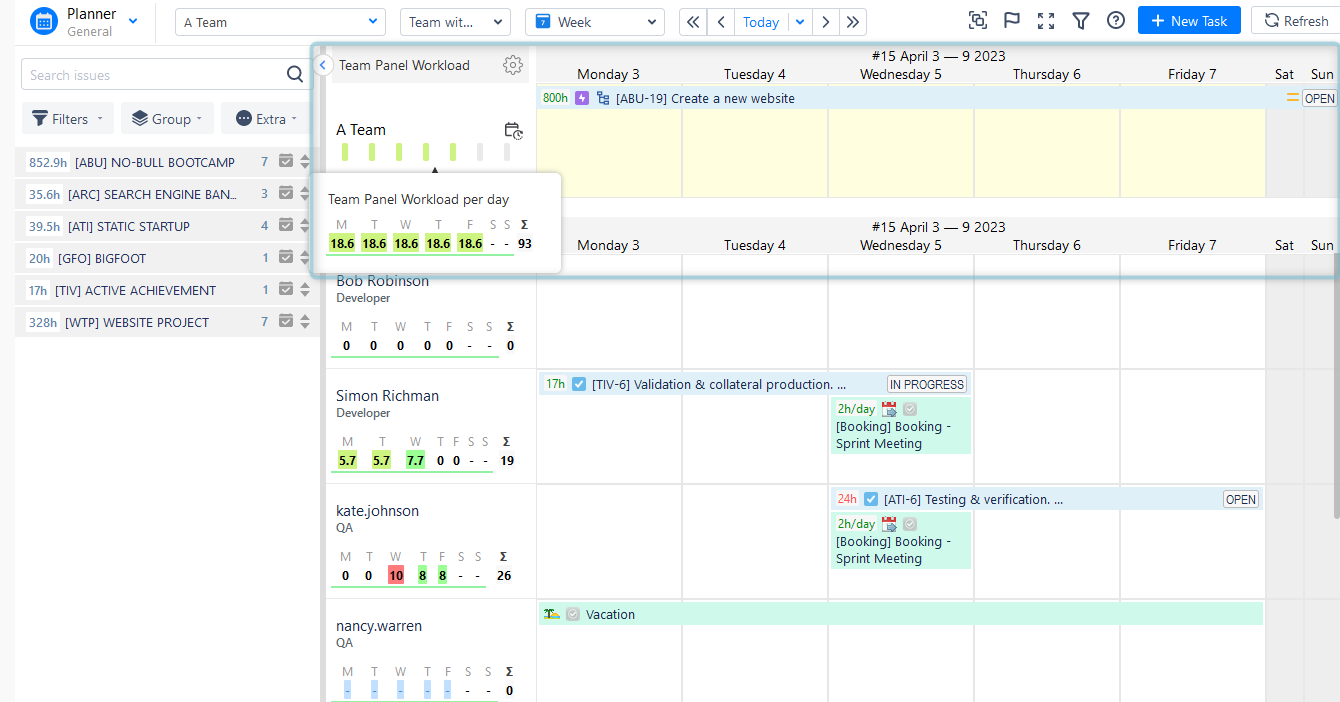
This app has 4 modules that provide visualization from various perspectives. The first module is a Plan View, that a is perfect combination of dashboard and timelines. Here you can find projects with tasks, that can be scheduled on the user and team timelines. They represent all of the users' activities, allow to schedule tasks, allocate resources, and understand resource utilization with the special workload indicators for both teams and users:
If the indicator is green, it indicates that the workload is within acceptable parameters. A yellow signal suggests that the user is experiencing a lower-than-usual workload, while a red signal indicates an excessive workload.
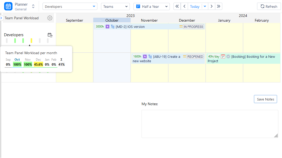
Each team has its timeline with tasks and workload indicators. You can get a comprehensive view of teams' and users' timelines with activities:
Or focus only on teams, to plan for long periods on epics, stories, or large Program increments:
Monitor Personal Progress
Our second visualization module is a Work View. It works like a personal space for each employee, where they can manage and track individual tasks and projects, working hours, request vacations, and log worked hours (both billable and non-billable).
Here users can visualize their working schedule and workload without distraction from their colleagues' tasks.

Visualize Data with Timesheets
The next module is Track View. Precise time tracking plays a pivotal role in effective project management and progress monitoring by enabling teams to oversee resource allocation, gauge productivity, and guarantee the punctual completion of tasks.
In the context of Jira, the incorporation of timesheet tools offers a convenient mechanism for recording and analyzing the time invested in various project activities. These timesheets provide in-depth insights into the distribution of time across tasks, empowering project managers to pinpoint instances of underutilization or excessive workload in resource allocation. The availability of consolidated timesheet reports allows project managers to view both individual and team-level time entries, facilitating precise and financial analysis, client billing, and invoicing.
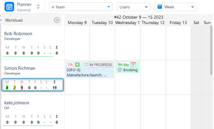
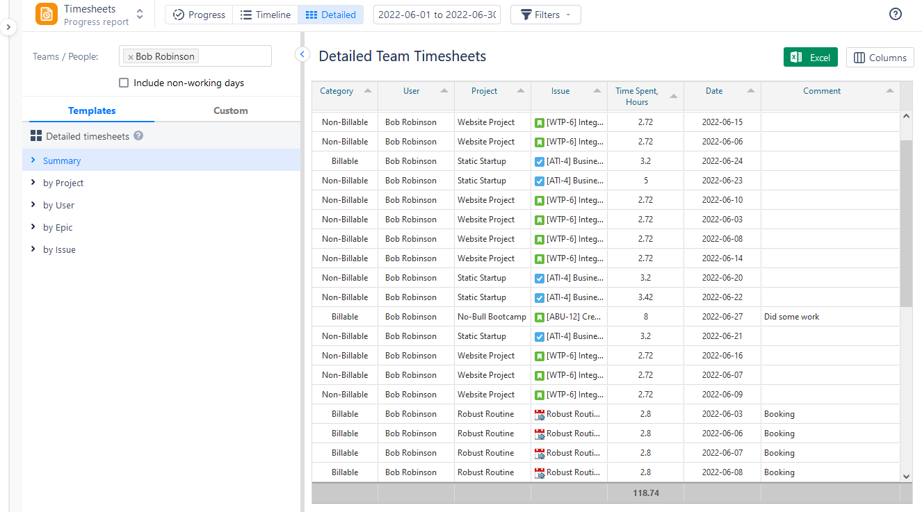
The Timesheet module serves as an effective tool for gaining insight into the time dedicated to tasks and projects by users. Utilizing ActivityTimeline Team Timesheets, you can easily discern how users allocated their time with just a few clicks:
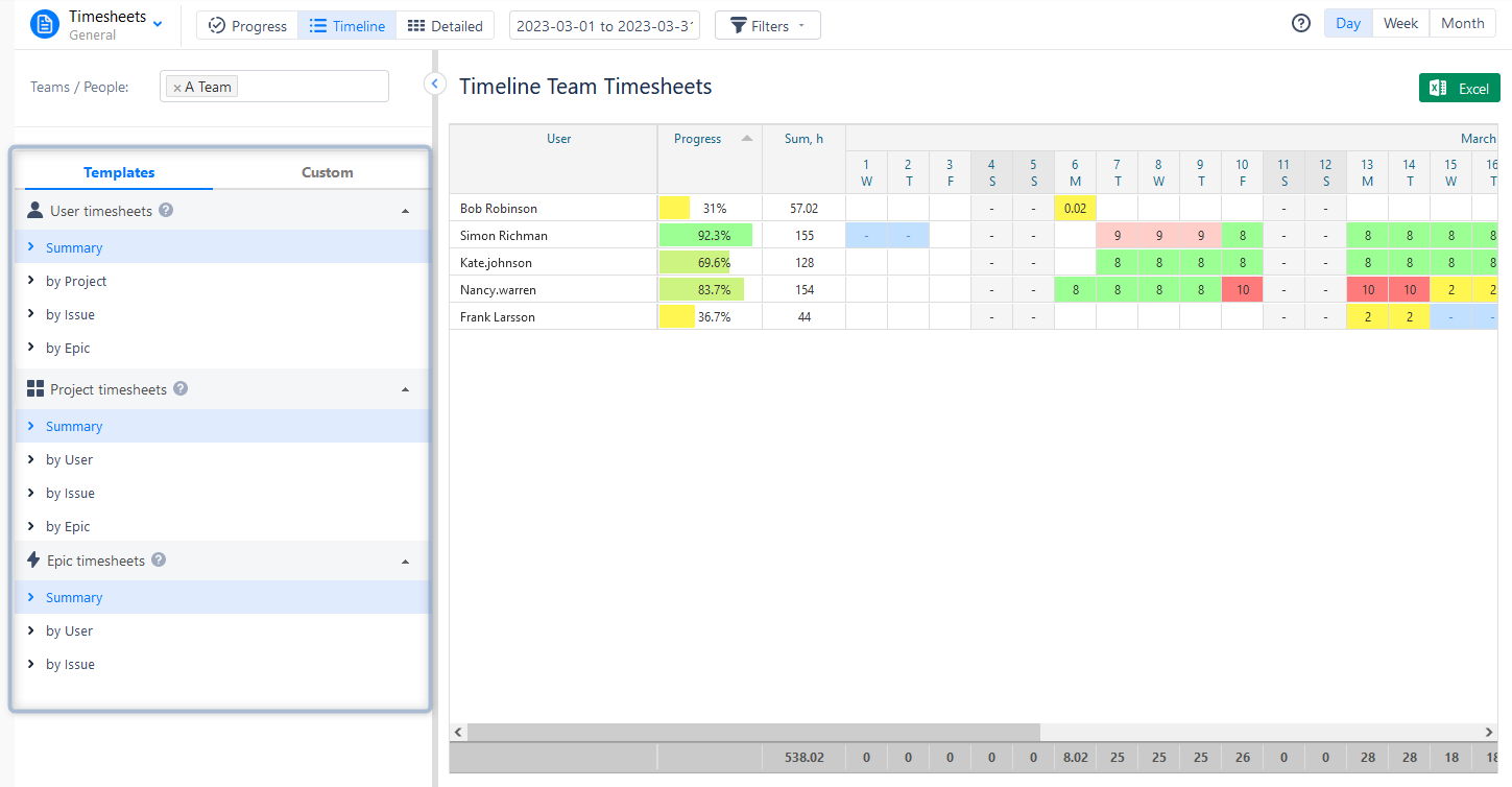
Users can choose from various timesheet templates: Progress, Timeline, and Detailed. Also, they have a possibility to add Jira Filters and track billable and non-billable hours logged.
Use Various Reports for Data Visualization
Tailored charts and reports play a crucial role in project reporting, offering visual depictions of essential project metrics and KPIs. Teams can create custom charts and graphs, or other visual representations derived from project-specific data extracted from Jira. These customized reports facilitate a better understanding of stakeholders regarding project performance, resource allocation, and the overall health of the project, fostering effective communication and informed decision-making.
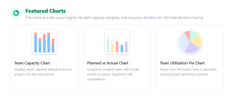
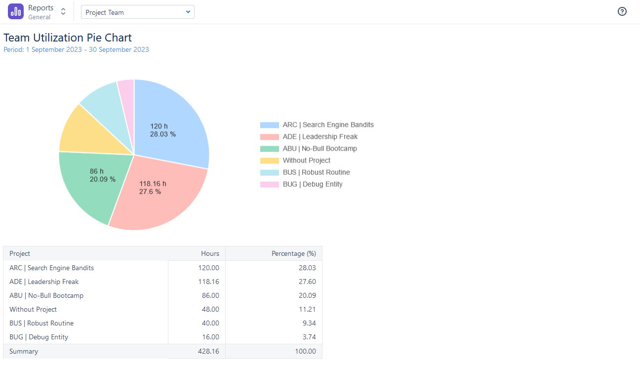
The fourth visualization module - Report View. It provides a robust reporting system that empowers users to create extensive custom reports on resource utilization, project progress, and task completion. These reports offer valuable insights into resource allocation, allowing the identification of areas where resources might be over or underutilized. Through the analysis of this data, teams can make informed adjustments and optimize resource allocation, thereby enhancing project efficiency and productivity.
As an illustration, the Resource Utilization Report provided by ActivityTimeline displays the real-time workload of resources within the selected scope, aiding managers in achieving an equitable distribution of workload among team members.

The app also provides an informative graphical representation of various data. Visualize everything with informative charts:
Conclusion
Jira's visualization tools offer a significant advantage in the world of project management. By harnessing the power of data visualization, project managers can make informed decisions, track progress, and communicate effectively with stakeholders. Whether you're managing complex software development projects or marketing campaigns, Jira's visualization capabilities along with the help of useful add-ons for Jira, like ActivityTimeline can elevate your project management to new heights.
FAQs
Are there any integrations that enhance Jira's visualization capabilities?
Yes, Jira offers a variety of add-ons and integrations like ActivityTimeline that can extend its visualization features, allowing for more customized and powerful visuals - reports, charts, planning dashboards, etc.
Can Jira visualization tools be used for resource allocation?
Absolutely. Visualizations in Jira can help project managers allocate resources efficiently based on task progress and priorities. Also, there are many add-ons for Jira, like the ActivityTimeline, which is a resource planning and tracking tool, that can facilitate resource allocation visualization with the help of the planning dashboard, reports, and charts.


