


A Jira Pie Chart Report can help understand your team's utilization, which is paramount to achieving productivity and efficiency. Whether you're overseeing a complex software development project or managing a marketing campaign, having a clear view of how your team's time and effort are allocated can make all the difference. This is where the Pie Chart Report comes into play.
Jira Chart Reports
Jira provides chart reports which are a set of graphical representations of project data that provide teams with a visual way to analyze and understand their progress, issues, and trends. These reports can be customized to display various types of data, making it easier for teams to track project performance and identify areas that require attention.
Users can find them in Jira Reports or include them in the Jira Dashboards. There are several types of pie charts in Jira:
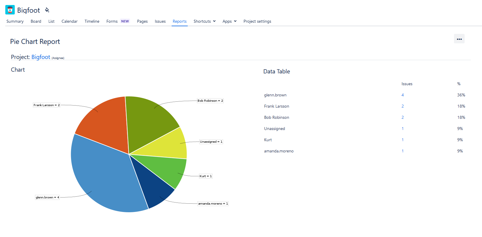
Pie Chart Report
This Report displays issues within a project or filter, categorized by a chosen field. This feature provides a quick overview of how the issues are distributed within the set, enhancing visibility and understanding.
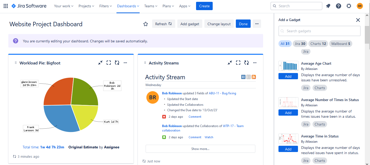
Workload Pie Chart Report
The workload pie chart depicts the issues related to a project or filter. You can choose whether to report on the team's current estimate, original estimate, or time spent.

Jira Dashboard: Pie Chart Gadget
You can add a workload pie chart report or other charts to your Jira dashboard. Just choose the needed pie chart gadget during the dashboard creation, or edit the existing one:
Users can also try improved charts in Jira add-ons, to expand their planning & tracking capabilities.
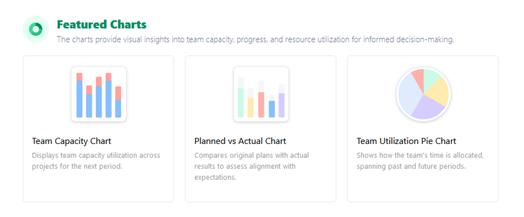
For example, ActivityTimeline - a resource planning & tracking tool for Jira offers a wide variety of reports and charts.
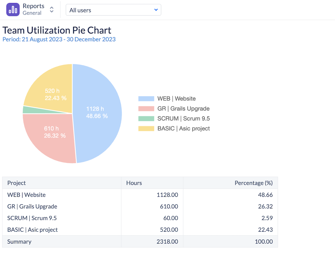
Team Utilization Pie Chart Overview
The Team Utilization Pie Chart is a visual tool designed to provide a comprehensive view of how a team's time is distributed across various projects. With options to view data for both the past and future, this chart helps managers and teams to reflect on past allocations and plan for upcoming tasks effectively.
Key Components of the Chart
There are two main components of the chart:
Past Time Allocation
Based on logged work hours, bookings & imported calendar events, this view showcases how the team's time was distributed across different projects in a completed period.
Future Time Allocation
Derived from estimates, bookings, placeholders & imported calendar events this perspective predicts how the team's time will be allocated in an upcoming period.
Chart Explanation
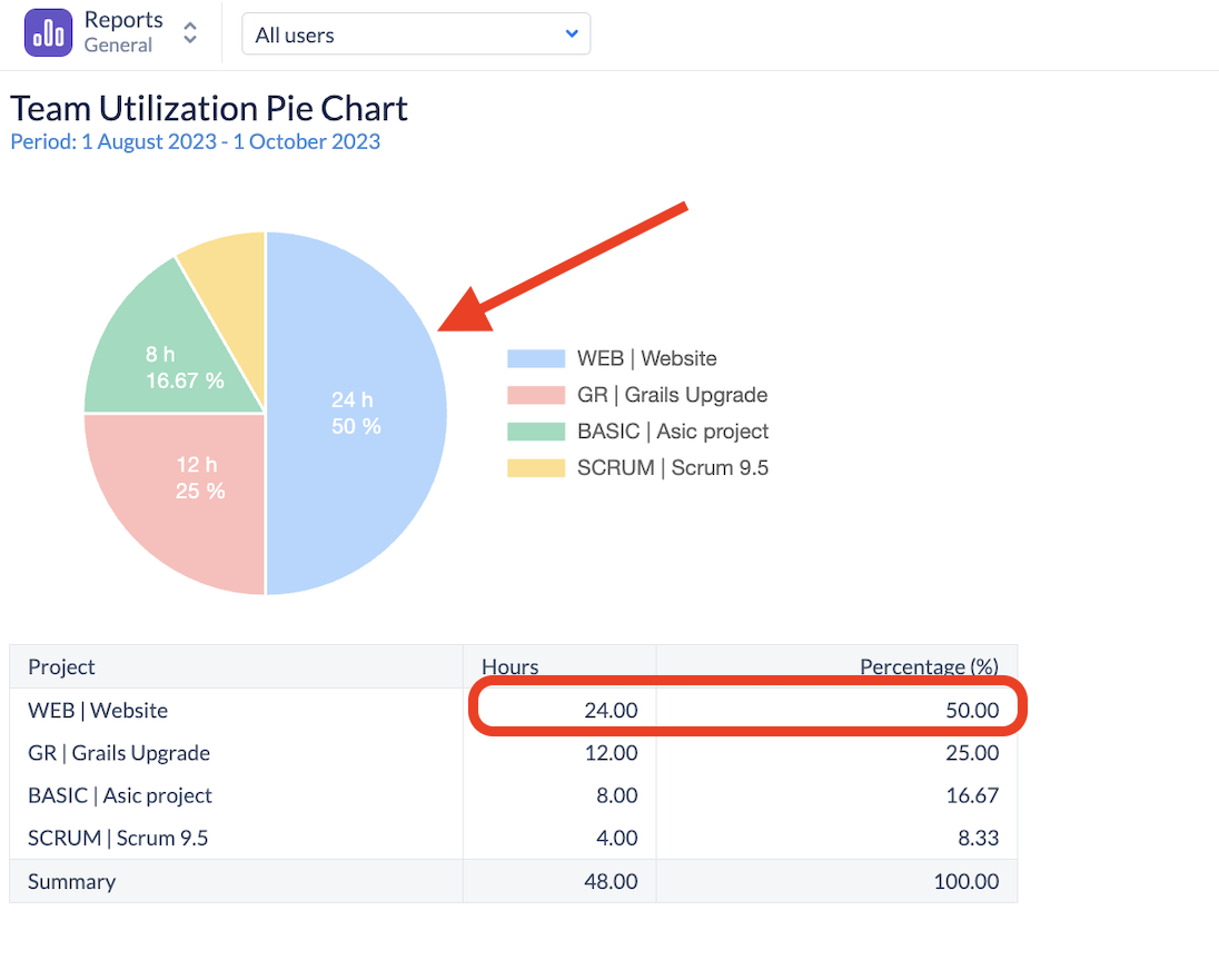
This report shows team time allocation for the future period
For the reported period, this team is scheduled for 48 hours, from which exactly 50% will be spent on the Website project, making it by far the most important project of this team.
Chart Configurations
Let’s dive into the chart configuration options:

- Reporting Scope - This config determines if to use Worklogs (Past)) or Estimates (Future) for the calculation.
- Team - select the team, whose time distribution you’d like to see.
- Period - switch between pre-defined periods for the past or future or choose a flexible period:
- Detailed by - the data can be aggregated by Jira project or epic.
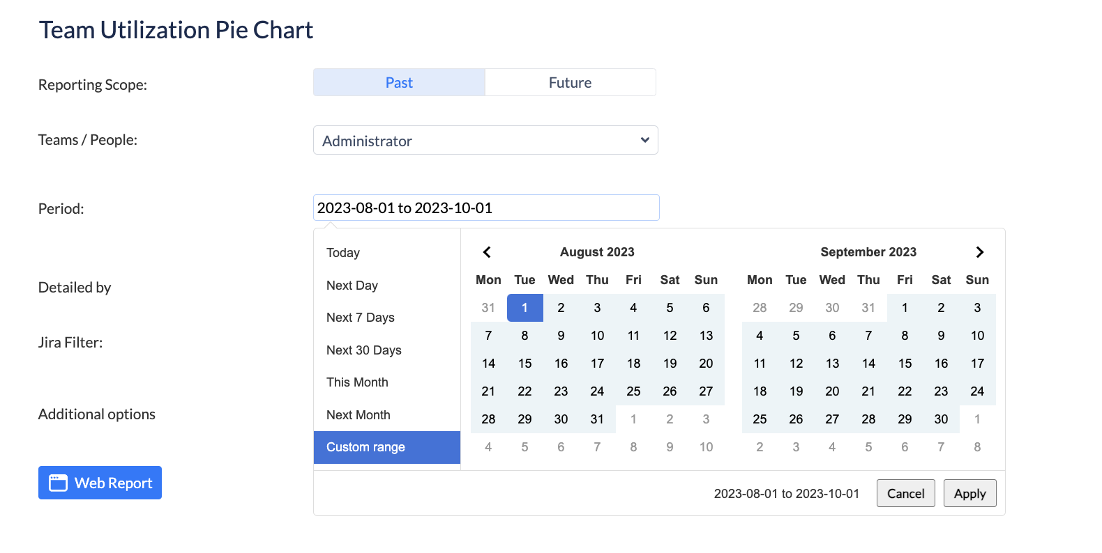
There is also a possibility to add a Jira Saved Filter to the report.
Conclusion
Understanding team utilization with the workload pie chart report empowers you to make data-driven decisions, enhance efficiency, and allocate resources effectively. ActivityTimeline's Team Utilization Pie Chart provides a great visualization of the team workloads which will be useful for Project Managers and stakeholders.
By incorporating the right tools and reports into your workflow, you can ensure that your team operates at its peak potential, driving your organization toward success.
FAQs
How can I generate a pie chart within Jira?
To create a pie chart in Jira, you can use the built-in reporting and charting features. You can find the pie chart reports (like the Workload Pie Chart) in the Jira reporting section, or add a pie chart gadget to your Jira dashboards. You can also try advanced charts in various add-ons for Jira, like ActivityTimeline.
How can I include a pie chart gadget on my Jira dashboard?
To add a pie chart gadget to your dashboard, just navigate to your dashboard, and click on "Edit Dashboard". In the gadget selection menu, search for pie chart reports or similar charting options. Select the desired pie chart gadget, configure the data source and parameters as needed, and save it in the same dashboard.


