


Monitoring your team’s progress is crucial for successful resource planning and project management. One highly effective method to achieve this is by employing a Planned vs. Actual chart, a potent tool that enables the comparison of primary project plans with the actual work completed. This insightful report sheds light on your project’s success.
This guide will take you through crafting a Planned vs. Actual chart in Jira, providing you with the tools to track your project’s performance efficiently.
What is a Planned vs Actual Chart?
A Planned vs Actual Chart is a graphical representation of planned tasks versus their actual execution within the Jira project management tool. It offers a bird’s-eye view of project progress, helping teams identify discrepancies and make informed decisions promptly.
The Benefits of the Charts
Real-time Insights for Informed Decision-Making
Informed decisions are the linchpin of success. Jira’s chart offers real-time insights, empowering stakeholders to make decisions based on accurate, up-to-the-minute data. This real-time functionality is a game-changer for strategic planning.
Enhanced Collaboration through Visual Representation
Communication is the lifeblood of any project. Jira’s visual representation of planned versus actual progress fosters enhanced collaboration among team members. The intuitive chart serves as a common language, ensuring everyone is on the same page, and expediting decision-making processes.
Proactive Issue Identification and Resolution
Identifying issues before they escalate is a hallmark of effective project management. Jira’s tool doesn’t just display data – it acts as a proactive sentinel. Deviations from the planned path are flagged, enabling teams to address issues in their infancy and maintain project momentum.
Client Confidence Through Transparency
Clients value transparency. Jira’s visual representation of planned versus actual progress fosters transparency by providing clients with a clear view of project evolution. This transparency not only builds trust but also facilitates open communication, ensuring clients are well-informed and satisfied.
Track Jira Issues with Reports and Custom Charts
Users can find a variety of reports and customizable charts across different types, that help to monitor project and issue progress and visualize any kind of data you need. Certain charts you can generate within the Jira Reporting section. You to effortlessly select the desired values and create them with just a few steps.
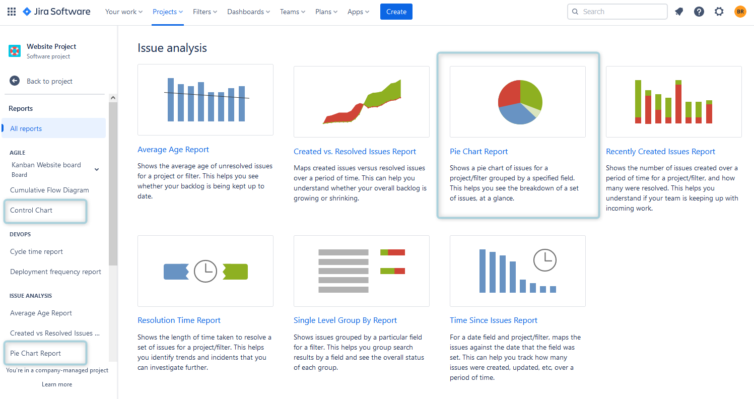
Another option is to create Jira Dashboards and add chart Gadgets to them:
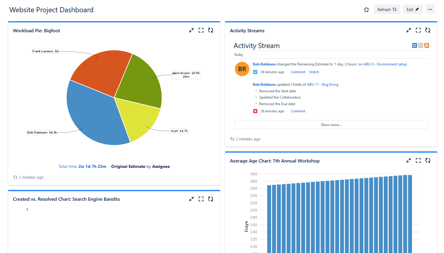
Jira Dashboard with Pie Chart
Jira users can also try different apps for Jira which are available in the Atlassian Marketplace. For example, ActivityTimeline is a resource planning and time-tracking app for Jira that provides various reports and charts for Jira and is compatible with Jira Software and Jira Service Management.
Planned vs Actual Chart in ActivityTimeline
The ActivityTimeline application provides a variety of advanced resource planning and project management reports and charts.
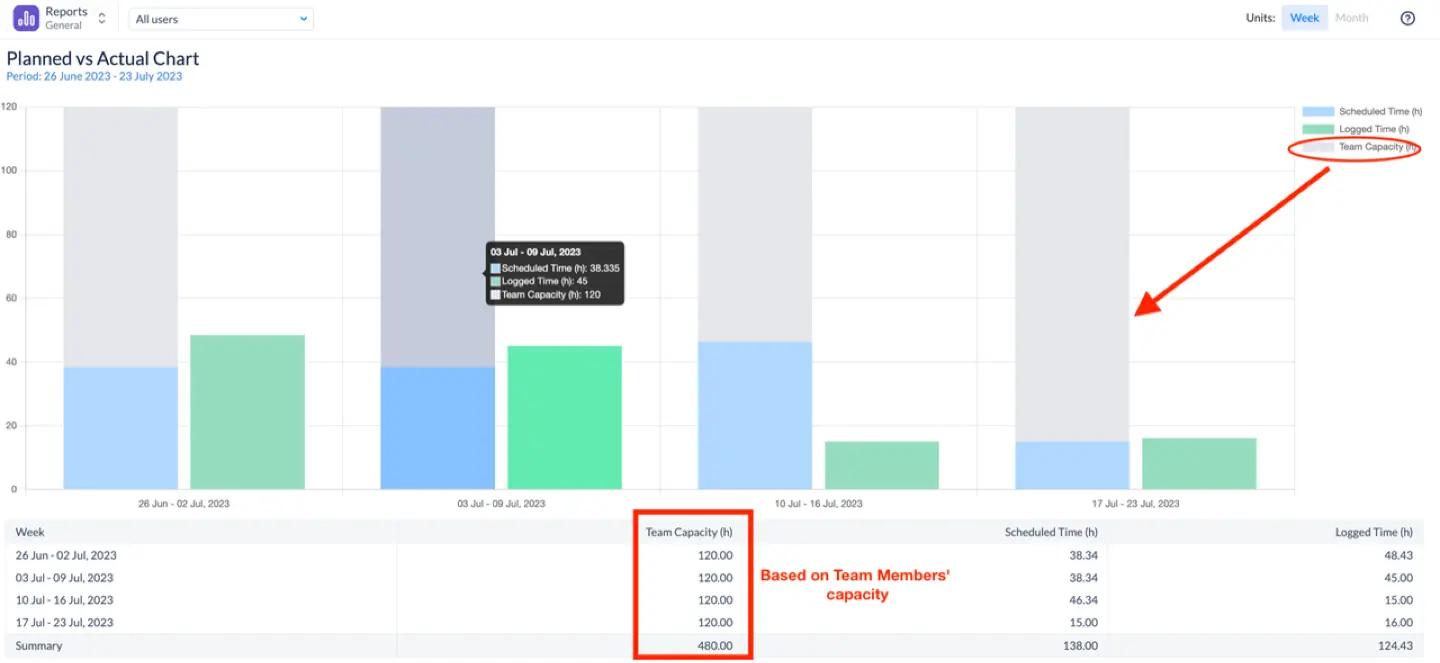
Among the app’s widely utilized charts, the Planned vs. Actual chart stands out. Its significance is invaluable, offering an overview of a team’s performance within a defined timeframe. This chart is designed to empower team leaders and managers, enabling them to compare the original plan with the actual time expended on task completion. All data is sourced from Jira, ensuring its timeliness and accuracy.
ActivityTimeline Planned vs Actual Chart
For a better understanding of the chart, let’s take a look at its main components:
Scheduled Time
Displays the workload allocated to the team across different projects, derived from the initial estimates of Jira issues, ActivityTimeline Bookings, and Placeholders.
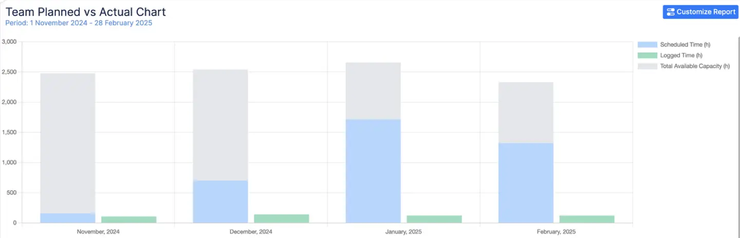
Logged Time
Illustrates the actual hours invested by the team, providing an authentic representation of the team’s productivity, as recorded through the Log Work dialogue, booking hours in the past, and imported calendar events.
Team Capacity
One of the most powerful aspects of the Planned vs Actual Chart in ActivityTimeline is its ability to incorporate Team Capacity—the total number of hours your team is actually available to work during a given period. When generating reports by team, this capacity metric is automatically included, helping managers understand whether the planned workload was realistic given the team's bandwidth. This level of insight is essential for identifying not only execution issues but also over- or under-planning scenarios.
Reporting Flexibility
Moreover, users can define the reporting scope using flexible filters. Whether you want to track a specific team, project, epic, or even use a custom Jira Filter, ActivityTimeline allows you to configure the chart to reflect your exact needs. Simply select your desired parameters before generating the chart, and you’ll receive a tailored visual aligned with your project structure.
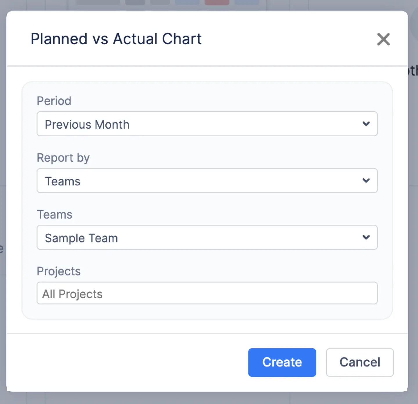
Chart Explanation
Here is a screenshot example. The screenshot indicates that during that particular week, the team miscalculated the time required to finish the planned work, resulting in a substantial overrun in task completion time.

The chart shows us that for weeks 26 December – 31 December 2023 we planned to spend around 260 hours per project, but instead, we spent over 325 hours. This implies the initial estimate was inaccurate, and we are falling behind the planned schedule.
The chart provides a week-by-week or month-by-month breakdown of planned vs actual trends, helping teams:
- Better tracking of planned vs actual work – Helps identify inconsistencies in estimates and execution.
- The smart legend at the bottom of the page helps you read the chart's trends and understand it better.

Conclusion
Creating a Planned vs. Actual chart in Jira is a powerful way to monitor your project’s progress, identify deviations from your initial plan, and take proactive measures to ensure success. With the support of the right planning reporting tools, like ActivityTimeline, you’ll be better equipped to manage projects effectively and deliver results that meet or exceed expectations.
FAQs
Can I create multiple Planned vs Actual Charts for different projects?
Users can create these charts with the help of the Jira add-ons like ActivityTimeline. It allows you to create multiple charts, tailoring each to the unique needs and dynamics of individual projects.
Is Planned vs Actual Chart in Jira suitable for Agile projects?
Certainly. Jira is renowned for its compatibility with Agile methodologies, making it an excellent choice for tracking progress in Agile projects. Jira doesn’t provide this type of chart, but both agile and business teams can use apps for Jira like ActivityTimeline to supplement the missing functionality.
Can I adjust the chart after it's been generated?
Yes! After generating the chart, ActivityTimeline enables dynamic editing through the settings menu. You can change the reporting team, switch between week or month views, modify the time period, or apply different filters—all without needing to recreate the chart from scratch. This flexibility ensures that your visual always reflects the most relevant and up-to-date project insights.
Does the chart offer help interpreting the data?
Absolutely. Each chart comes with a smart legend at the bottom, designed to help users quickly grasp the data being presented. Whether you’re analyzing scheduled time, logged hours, or team capacity, the legend ensures your team can interpret trends accurately and take action where needed.


