


If you're looking to take your project management and resource planning to the next level, understanding how to create custom charts in Jira is a crucial skill. Jira, a powerful project management tool, allows to tailor charts to meet users specific needs, providing them with invaluable insights into their projects.
In this article, we will explore tips on how to create Jira custom charts with ActivityTimeline, with the main focus on the Team Capacity Chart.
What is a Jira Custom Chart?
The Jira Custom Chart is a dynamic feature that enables users to create and customize charts, graphs, and reports tailored to their project's unique requirements. It allows you to visualize data, track progress, and make data-driven decisions efficiently.
How to Get a Custom Chart in Jira?
There are a few ways to create custom charts for Jira:
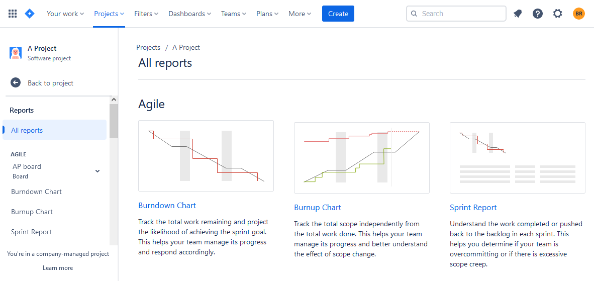
Jira Reports and Charts
You can find some charts in the "Reports" section:
Visualize Jira Data with Jira Dashboards
Advanced users like to create a Jira Dashboard and add various reports charts and graphs:
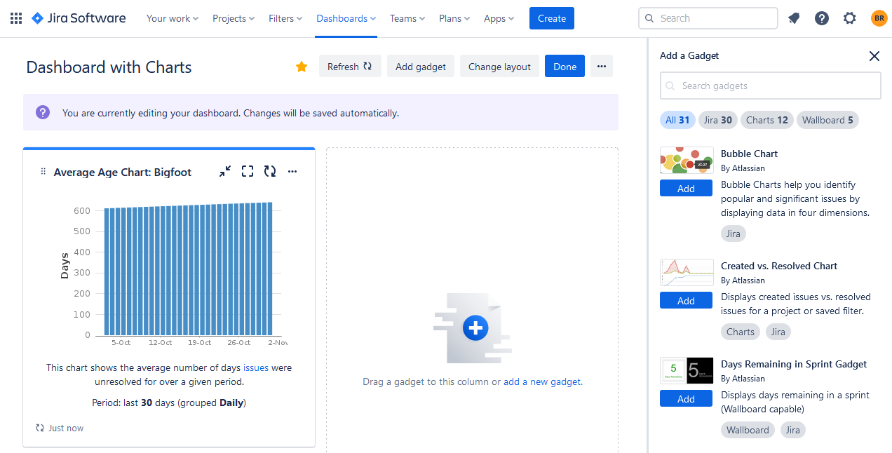
Users can find many chart templates here: a pie chart, bar chart, grouped bar chart, line chart, multi-line chart, etc.
Use Add-ons for Jira
Jira offers different integrations in the Atlassian Marketplace that can sufficiently supplement the users' needs. For example, if you need more charts you can try ActivityTimeline - a resource planning and tracking app that provides facilitating reports and charts for a better monitoring experience.
The app is available for Jira Cloud/Jira Data Center.
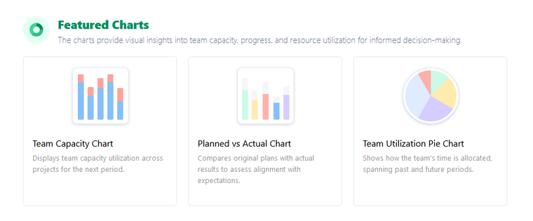
Team Capacity Chart for Jira
You may check ActivityTimeline's Team Capacity Chart for Jira. It serves as a visual tool aimed at helping managers observe their teams' workloads and availability during a specific timeframe.
It offers a straightforward and concise representation of how a team's available capacity is distributed and employed, simplifying the process of project planning and management for teams.
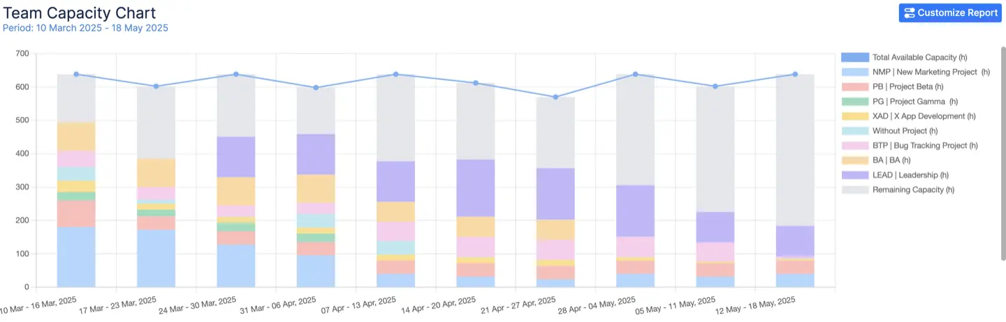
Its main components include:
- Available Capacity: Represents the combined capacities of the team members, accounting for all non-working commitments such as vacations, days off, and overtime.
- Used Capacity: This means the total workload allocated to team members, which is determined by the remaining estimates in Jira tasks, bookings, placeholders, and imported calendar events.
- Remaining Capacity: Reflects the variance between the total available capacity and the capacity already allocated (used capacity).
- Utilization: Presented as a percentage, this component reveals how much of the team's capacity has been scheduled for the given period.
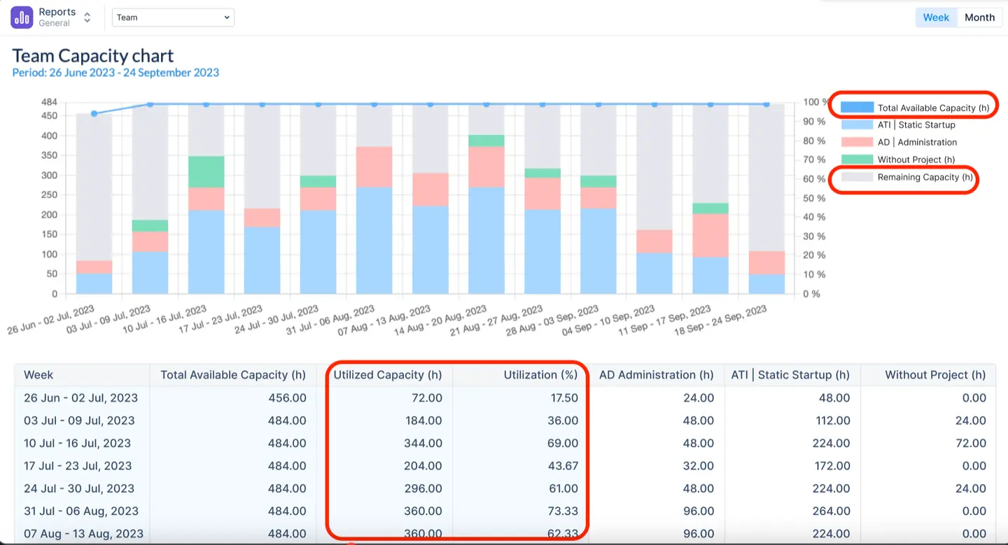
For example, here we can see that we utilized 35% (311.60h) of the team capacity, which is around 1/3. So, we can conclude that we still have 568.4 available hours to use. The team is underloaded, and we need to fix this situation.

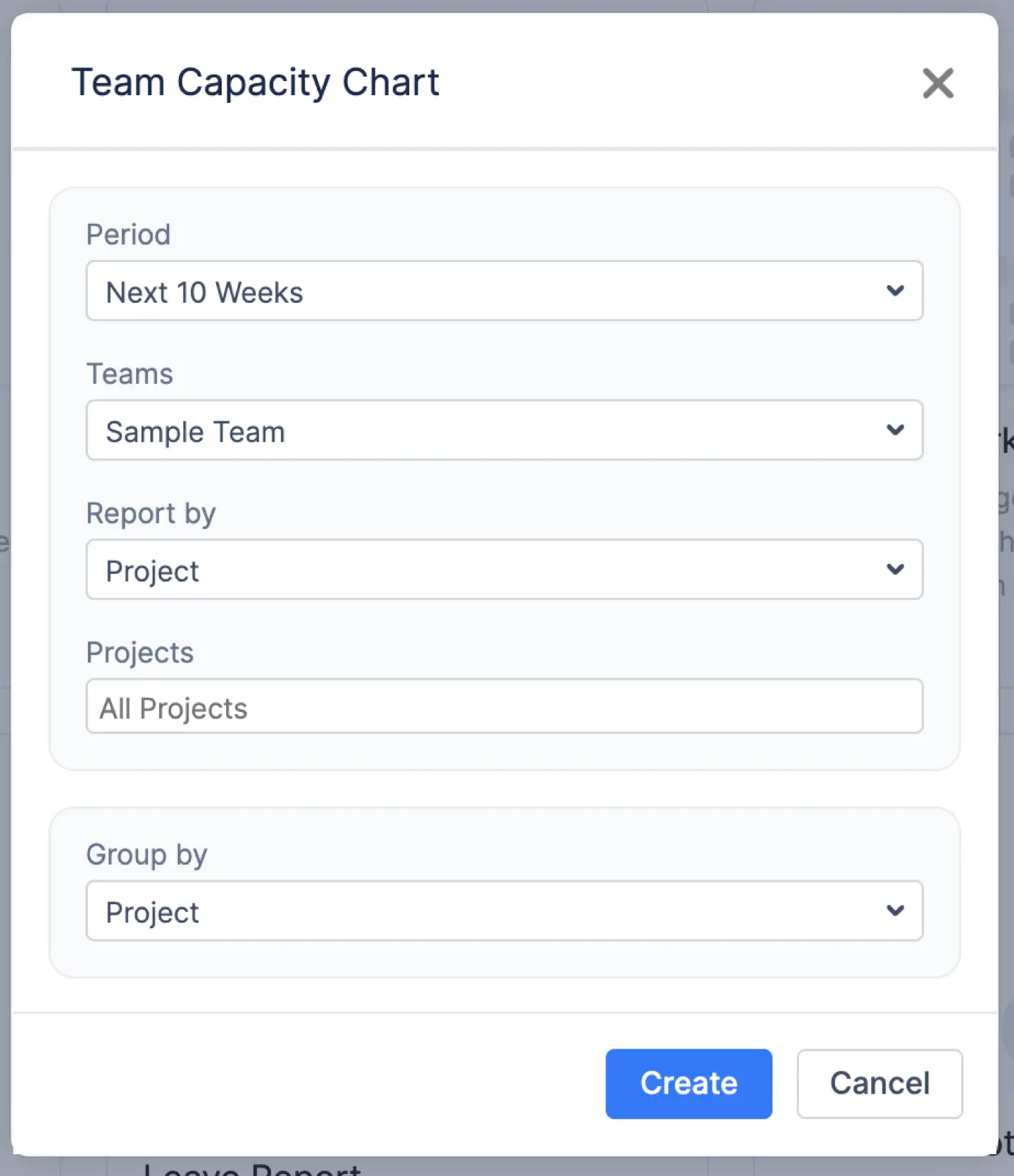
It’s very simple to generate the report. Chart configurations allow you to choose a team (chart can be generated only for a single team at a time), period (default or custom), projects, and unit - week or month. There is also a possibility to add a Jira Filter.
Don't forget to include or exclude Jira issues, Bookings or Placeholders -as a default setting, the chart incorporates all items that have estimates, yet you have the option to exclude them when generating the report.
Conclusion
Custom charts for Jira are very useful for Project Managers and their teams as they can not only monitor progress in real time but also delve into the intricacies of their projects, identify areas for improvement, and make well-informed, data-driven decisions.
FAQs
Is it possible to generate charts within Jira?
Yes, it is possible to generate charts within Jira. Jira, a popular project management and issue-tracking tool, offers various built-in features for creating charts and reports to visualize and analyze Jira data. Some of the common types of charts you can generate in Jira include burndown charts, cumulative flow diagrams, pie charts, bar charts, etc. You can also use Jira plugins like ActivityTimeline to get more chart reports.
What is meant by custom charts in Jira?
Custom charts in Jira refer to charts or graphs that you create and tailor to specific data and visualizations, allowing you to represent project information in a personalized way. They are available in the Jira reporting section, Jira dashboard, or in the add-ons for Jira, like ActivityTimeline.
How can I personalize the layout of a dashboard in Jira?
To personalize a Jira dashboard layout, you need to edit the dashboard, rearrange or resize gadgets, add new gadgets or remove unwanted ones, and save your changes.


